
Responsive design to protect against mobile-first conversion

Mobile-First Index from Google
In September 2020, the switch to Google’s Mobile-First Index took place. This means that websites will no longer be ranked based on their desktop (computer) view as before, but only on the smartphone version.
Many top ranked websites on Google will suffer due to this change if they do not have a good and mobile version of their website in time.
Google has also informed that it is no longer timely to create a separate mobile version of the website, so you could just leave the existing website as it is. So, the complete website as such must work on desktop and smartphones. This applies not only to organic reach, but also to the price of your ads on Google and Facebook
The exact terminologies for this behavior of a website are “responsive design” and “liquid design”. You should definitely combine these two, but more on that later.
What is liquid design?
Liquid design means that texts, boxes, buttons and the like also increase and decrease in size when the browser window is enlarged or reduced. However, the structure of the web page should remain the same.
You can think of it like if a web page has 3 columns next to each other on the computer, it will also have 3 columns next to each other on the smartphone. Of course, these are then extremely squeezed together. The layout of the website in this case is meant for a computer and not for smartphones. To get a handle on this problem, you need to do a little more than use variable widths.
What is responsive design?
Unlike liquid design, responsive design changes the page structure and layout on different screen sizes.
With the previous example, with responsive web design we would now have only one column on the smartphone, so that the content has enough space and does not crowd each other.
Likewise, it is possible to omit decorative images from the mobile version of the website so that users don’t have to look at posts or pages that take forever. Now that everything is underneath each other, you have to pay attention to the length of the content. It is important here that no texts are removed on the smartphone, because Google only pays attention to the smartphone version of your website and you want your texts to be findable for Google and also in Google’s ranking.

WordPress in the long run
WordPress offers a wide range of third party plugins to help you build your website. They help you to implement the design and to place your newsletter forms in the right place. Few extensions focus on the long-term maintenance of a WordPress website. We at Orbitype have made it our mission to make life easier for you, the website owner, so you can do the same for your customers.
Read More
Search engine advertising and paid social media marketing
Content Search engines organic Search engines paid Pull marketing Push Marketing Social media advertising organic Social media advertising paid Target group Funnel Minimum advertising budget General indications for organic reach General paid reach cues Organic search engines Search engines like Google and co.: These are responsible for the long-term success of a website and should …
Read More
Passive Monetisation Part 1/2
To passively monetize your website, there are also options, but not as many as active monetization. Internet advertising (Google AdSense)…
Read More
Content management systems simply explained
Content management systems like WordPress, Typo3 and Drupal CMS (Content Management Systems) behave differently than page builders. A CMS is…
Read More
Define target audience – Who is your target audience?
Why do I need to know my target audience? In order not to waste the energy you put into your marketing, you should know as precisely as possible which people consume/use your product. Because the less accurate you are, the more expensive your Facebook ads will be, for example. Likewise, the potential customers who are
Read More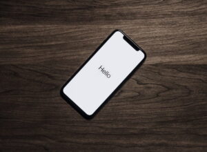
Responsive design to protect against mobile-first conversion
Mobile-First Index from Google In September 2020, the switch to Google’s Mobile-First Index took place. This means that websites will…
Read MorePlans & pricing
Stay cool, we have a 48-hour money back guarantee!