
Responsive design to protect against mobile-first conversion

Mobile-First Index from Google
In September 2020, the switch to Google’s Mobile-First Index took place. This means that websites will no longer be ranked based on their desktop (computer) view as before, but only on the smartphone version.
Many top ranked websites on Google will suffer due to this change if they do not have a good and mobile version of their website in time.
Google has also informed that it is no longer timely to create a separate mobile version of the website, so you could just leave the existing website as it is. So, the complete website as such must work on desktop and smartphones. This applies not only to organic reach, but also to the price of your ads on Google and Facebook
The exact terminologies for this behavior of a website are “responsive design” and “liquid design”. You should definitely combine these two, but more on that later.
What is liquid design?
Liquid design means that texts, boxes, buttons and the like also increase and decrease in size when the browser window is enlarged or reduced. However, the structure of the web page should remain the same.
You can think of it like if a web page has 3 columns next to each other on the computer, it will also have 3 columns next to each other on the smartphone. Of course, these are then extremely squeezed together. The layout of the website in this case is meant for a computer and not for smartphones. To get a handle on this problem, you need to do a little more than use variable widths.
What is responsive design?
Unlike liquid design, responsive design changes the page structure and layout on different screen sizes.
With the previous example, with responsive web design we would now have only one column on the smartphone, so that the content has enough space and does not crowd each other.
Likewise, it is possible to omit decorative images from the mobile version of the website so that users don’t have to look at posts or pages that take forever. Now that everything is underneath each other, you have to pay attention to the length of the content. It is important here that no texts are removed on the smartphone, because Google only pays attention to the smartphone version of your website and you want your texts to be findable for Google and also in Google’s ranking.

What to automate & what not to automate?
Small businesses in particular should urgently automate parts of their day-to-day operations in order to have more capacity to serve…
Read More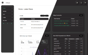
Seo & Workflow focused WordPress Admin alternative Orbitype
The WordPress admin area is great for creating a website. Many plugins are installed to the creation are unavoidable. This becomes a problem as soon as the creation of the website is finished. Too many plugins have pop-ups and makes the whole user interface (WP-ADMIN) very confusing for everyday adjustments. Orbitype provides a pleasant working…
Read More
Passive Monetisation Part 1/2
To passively monetize your website, there are also options, but not as many as active monetization. Internet advertising (Google AdSense)…
Read More
Pagebuilder – Effects on SEO and Extensibility?
Page builder websites are also called website building kits (Jimdo and co.). You can register on their website and directly…
Read More
Email marketing & Co. – communication channels but which ones?
If you believe all these Internet gurus, you quickly realize that many are just chasing the latest trend, but often forget that end users and website users like to find their way and then keep it that way. Communication channels Especially when you ask yourself the question: How do I communicate with my customers?
Read More
Paid advertising (social media/search engines)
Paid online advertising – pull advertising and push advertising Billboard advertising, as it has existed for ages, would be called…
Read MorePlans & pricing
Stay cool, we have a 48-hour money back guarantee!